JANICE LINDSAY - international insights & new directions design
Janice Lindsay’s motivating seminar at the Australian International Furniture Fair & Decoration + Design trade fair in Sydney in February was all about the more relaxed, intuitive and natural shift that interiors are taking, while the traditional formality of design is being interrupted with bursts of colour. ‘The design now – don’t think, but feel’ approach, combined with design trends across the globe, are literally changing the world we live in’, says Janice. As an interior designer in Adelaide i am always looking for stylish living ideas i can introduce into my designs.
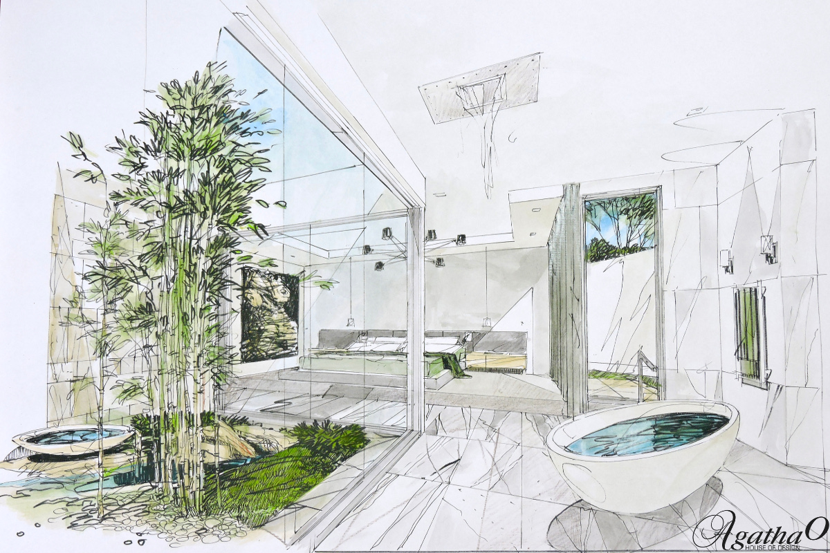
The ‘cardboard look’, as referred to and observed by Janice, describes the shift to natural colours and textures, influenced by environmentally friendly living and minimalism. ‘This is the new “eco green” with added fusion of bright colour’, she says.
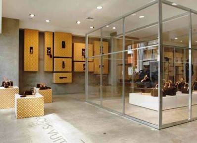
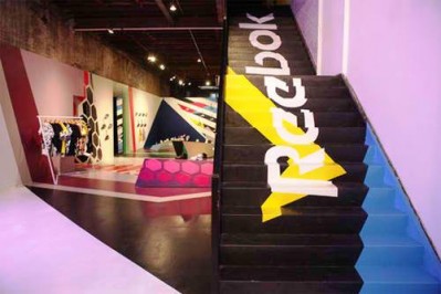
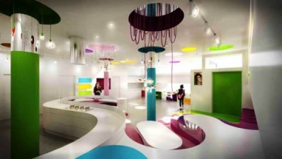
The phenomenal interest in and success of ‘pop up stores’ are also an influencing factor in this design shift, according to Janice Lindsay. Pop up stores are a marketing tool for major brands with new products to launch as well as a means of introducing new artists/designers into the social media circle. They are retail shops that open for a few days in major locations – only to be ‘gone tomorrow’.
A successful pop up store requires an overnight set up, usually with dramatic theatrical-like designs, to draw celebrity crowds so that the media follows it closely. This event is played out on the social pages of magazines, creating overnight successes.
‘Wabi sabi’, again a new design shift, refers to the beauty in things that are imperfect, humble and handmade.’ It’s all the stories behind the dents and scratches of worn timber, for example that make things memorable and beautiful.’
Since the global financial crises, our buying patterns have also changed: we buy less, we buy better and we buy local. ‘Made – not manufactured is what we look for’, says Janice. Also we want smarter technology and designs that look after the environment.
The social factors that influence us are also changing the way designers design, ‘we are driven by social media and generation Y – both value products that are playful and engaging.
And don’t underestimate the power of women, referred to as ‘womenomics’ – women in positions of power who are especially influential on product designers. ‘They are collaborative, empathetic, intuitive and particular, and therefore drive trends in today’s market place.’
As for colour itself and its pallete, we are encouraged to go back to the cave man era to draw inspiration from the most artistic woman of all time, ‘Mother Nature’. ‘Nature is all around us and has more than 10 million years of experience’. As Janice explains: ‘in nature there is no such thing as a colour mistake; it is a masterpiece of natural design; we prefer to live with nature, so why not be influenced by her colour palettes? As it is, we imitate her with our clothes, which is why we have summer, winter, autumn, and spring palettes. We also imitate her texture, depth and curves.’
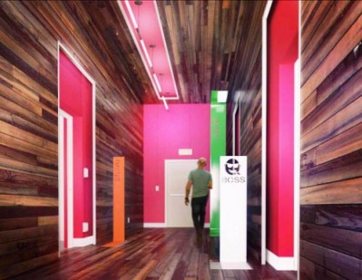
Today, large corporations are going through big makeovers to stay ahead of competitors and encourage fresh ideas, as well as increase productivity and lower staff turnover. These office spaces are being transformed from the plain and impersonal into studio atmospheres, with the idea being to create overall harmony and to be stimulating and productive. We are encouraged to keep away from whites and especially pure white, as research has shown it to be not so good for overall health and wellbeing. People who do IQ tests perform much better in a coloured room than in a plain white environment, and yet 80% of paint sold is white. Pure white also makes us edgy, restless and we lose focus. One of the ways Janice encourages us to add colour to a room is by painting the 5th wall, the ceiling, and or colour blocking, which is a play on play with colour.
Feature walls are a big no-no, unless we are using wallpaper to add texture and depth. If you are worried wallpaper is not here to stay though, think again. Wallpaper is only getting bigger and better! With today’s technology, we even have ‘tear off’ wallpaper collage, which is proving popular. ‘It allows individuals to be personally engaged in their own individual room design.’


‘womenomics’ what a great word (leave a comment)
AGATHA O house of design – interior decoration & design is an award winning interior design Company in Adelaide, South Australia writing about lifestyle and WHAT’S HOT in the world of interior design, architecture, art and travel.

Contributor
AGATHA OZHYLOVSKI
Agatha Ozhylovski is the creative director behind AgathaO House of Design. Agatha infuses art, music, and fashion every step of the way. She believes in a Vogue way of living, working and playing; where design is defined by people, lifestyle and culture.

